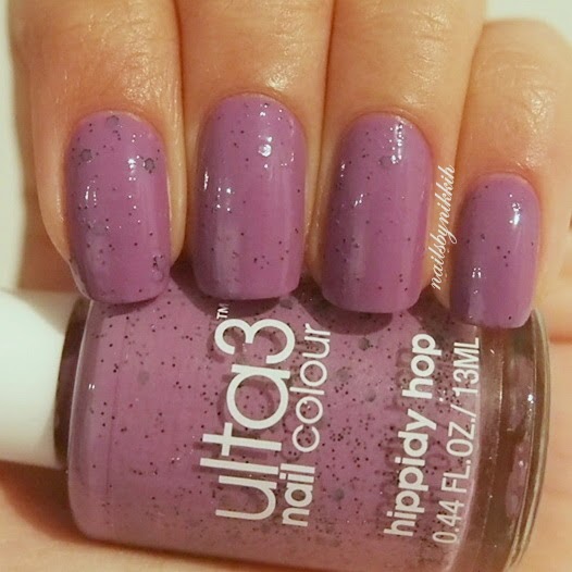
How Spring/Summer appropriate are these nails?! After receiving a nail polish package from Ulta3, my new current nail art addiction is playing around with 'watercolour' polishes. These are special polishes that apply transparently and can be built up to intensify the colours. The base of this design is lovely in itself but I added some polka dots to give it a cuter effect.
This nail polish set from Ulta3 comes with 5 colours (1 white & 4 watercolours) for just $10! You can also buy them separately for $2. I was always keen to try out the OPI watercolour polishes but was put off by the hefty price. These Ulta3 polishes work in the same manner and I have read multiple comparative reviews that have suggested that they are even better than the OPI ones!
Even without comparison, to me the formula for these are close to perfect. Although the white polish is quite standard, taking 2-3 coats to be opaque, it still does its job as a base colour. The watercolour polishes work well with a single coat and do not take long to dry.
A thing to note about these polishes is that you can achieve a lighter, more pastel shade by removing most of the polish from the brush before applying, or alternately, layer/apply thicker coats to achieve a darker shade. To obtain the cohesive watercolour splatter effect for this tutorial design however, I opted for the first option.
- Apply white polish until opaque.
- Before applying the first watercolour, wipe off most of the polish from the brush onto the edge of the bottle. Lightly dab the colour in randomised positions on the nail. Irregularity and inconsistency is the key here. Don't try too hard to make it look perfect because the randomness is what gives a nice effect.
- Choose a second colour and apply it in the same way as step 2. You may choose to overlap the first colour in some areas to allow for smooth transitions between the two colours.
- Choose a third colour and apply in the remaining spaces.
- Add in some polka dots using a dotting tool.
If you don't like the polka dot look, this is what the watercolour base looks like by itself. It is still pretty and definitely Spring/Summer appropriate! A big tip that I suggest for this design is applying the colours from least to most transparent. What I mean by this is that some of the colours in the pack are more transparent than others; applying the most transparent last means that you can overlap the colours more seamlessly when filling in the remaining white spaces at the very end.
Hope you enjoyed this tutorial. I'd love to see your recreations on Instagram! (tag me @nailsbynikkih)
*This product was sent to me for review. I maintain that the views in this post are my most honest opinions.*


